Illustrations for Pora na Telesfora
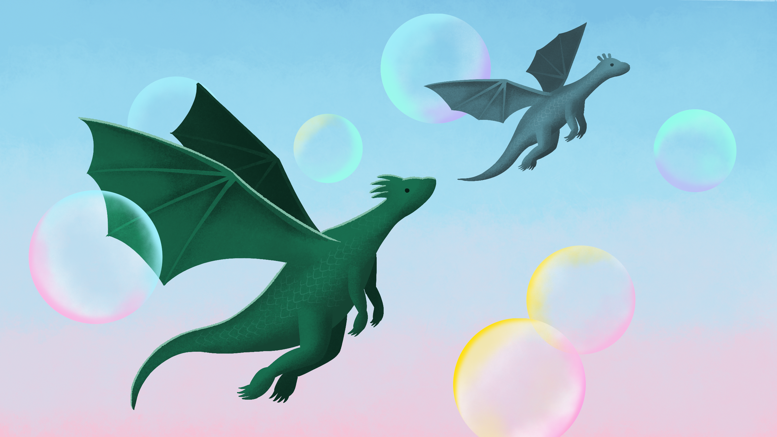
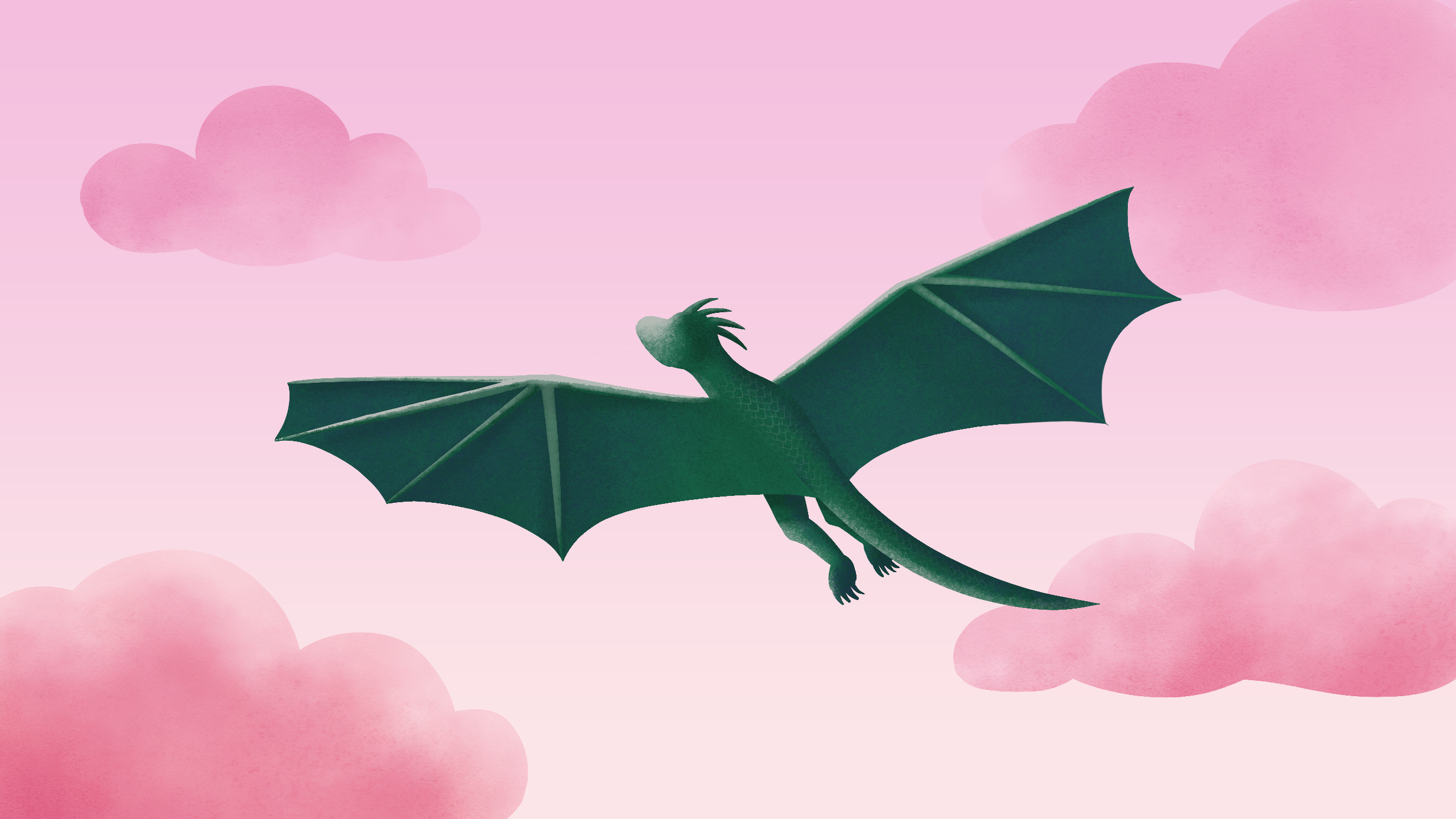
During my cooperation with Warner Music Poland, I created a series of twelve illustrations for “Pora na Telesfora”, a music radio play from 1977, based on a television program for children.
The main characters are two dragons: Telesfor and Teodor.
First, I offered the client moodboards with three different directions in which we could go. Then I made sketches for all the pieces. I finished the illustrations in Adobe Photoshop.
I wanted to achieve a joyful, child-friendly atmosphere, so I used warm colors, textures, noises and patterns.
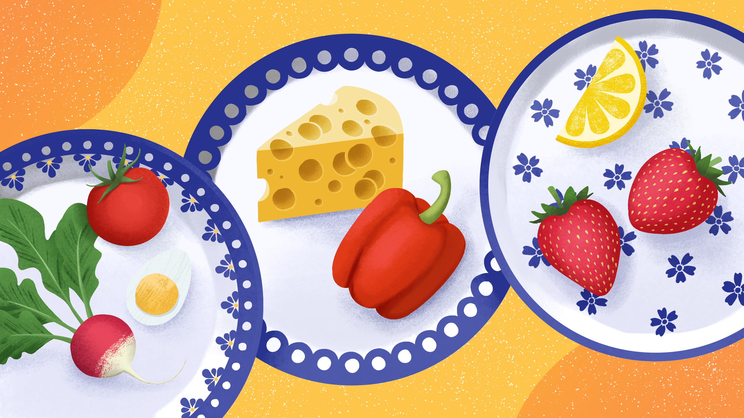
In order to pay tribute to the fairy tale, I drew its main characters, as well as a TV set from the 70s (model Saturn 201) and traditional plates from Bolesławiec.
Each of the illustrations is inspired by the text of the songs, for example “Kucharz” (Cook) shows the dragon Telesfor in a chef’s outfit, and in the background the elements mentioned in the piece: a piece of cake, candy, lollipop, hen, donut and meringue. In the illustration for “Jarzębina” (Rowan tree) I drew a branch of the title tree surrounded by autumn leaves, and “Cztery słonie” (Four Elephants) depicts the eponymous elephants with bows on their tails while wandering through the mountains.
Client:
Warner Music Poland
tools:
Adobe Photoshop


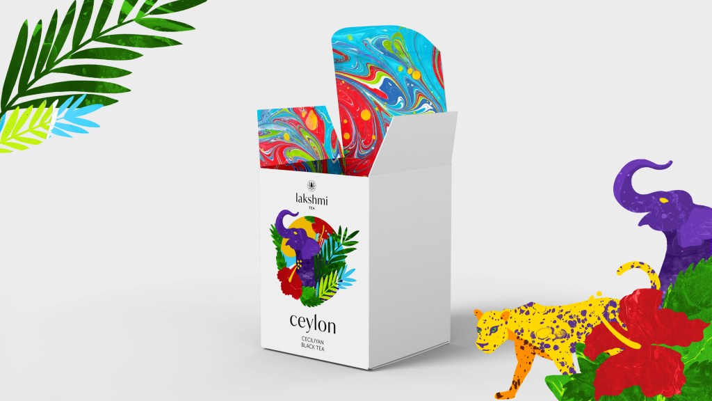
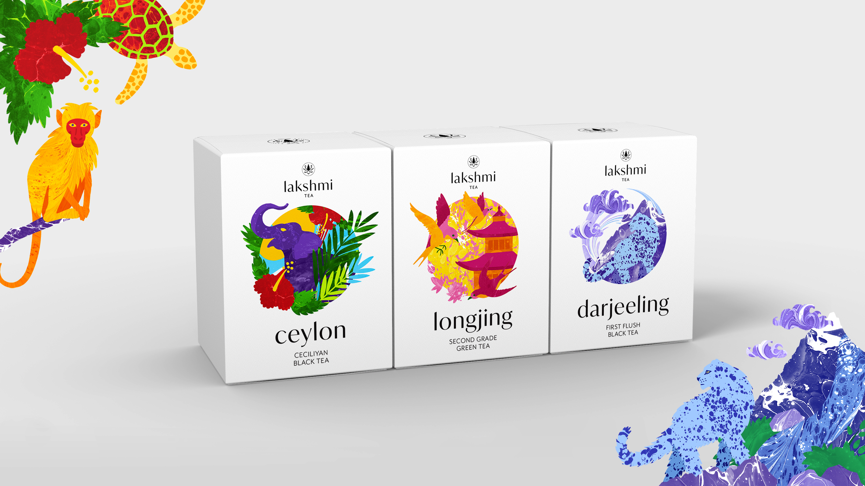
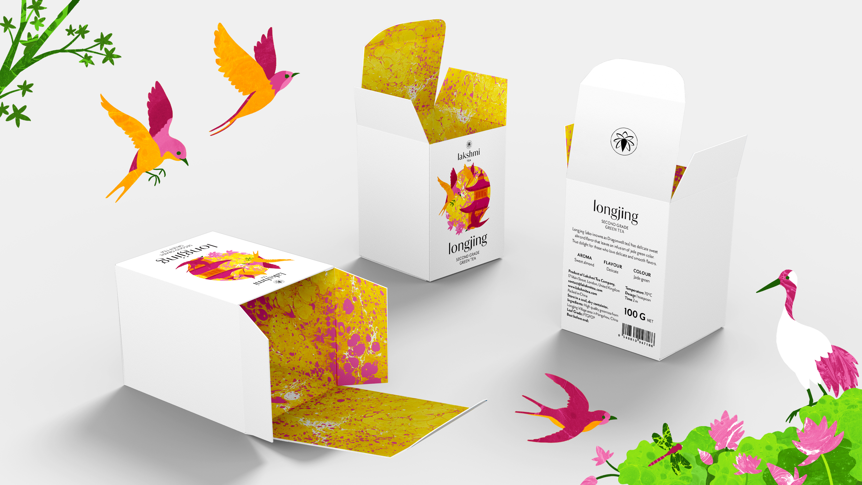
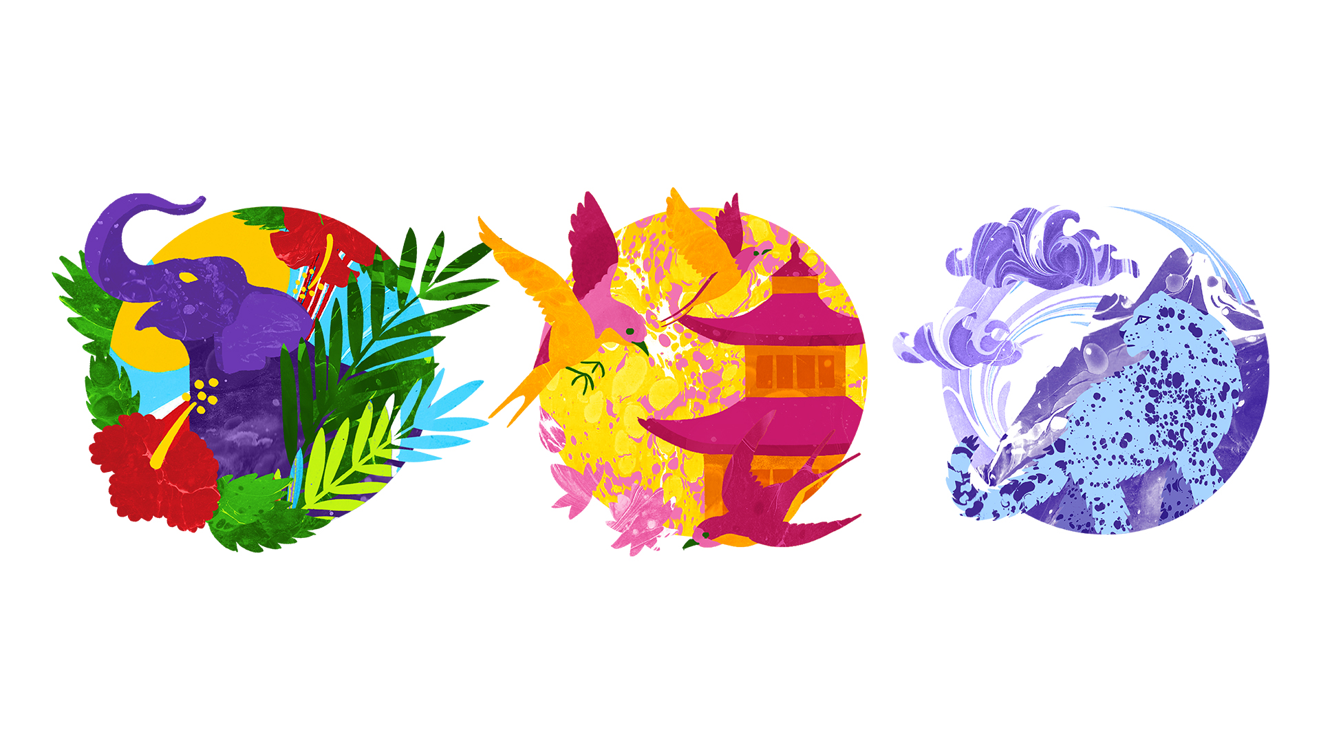
Tea packaging and illustration
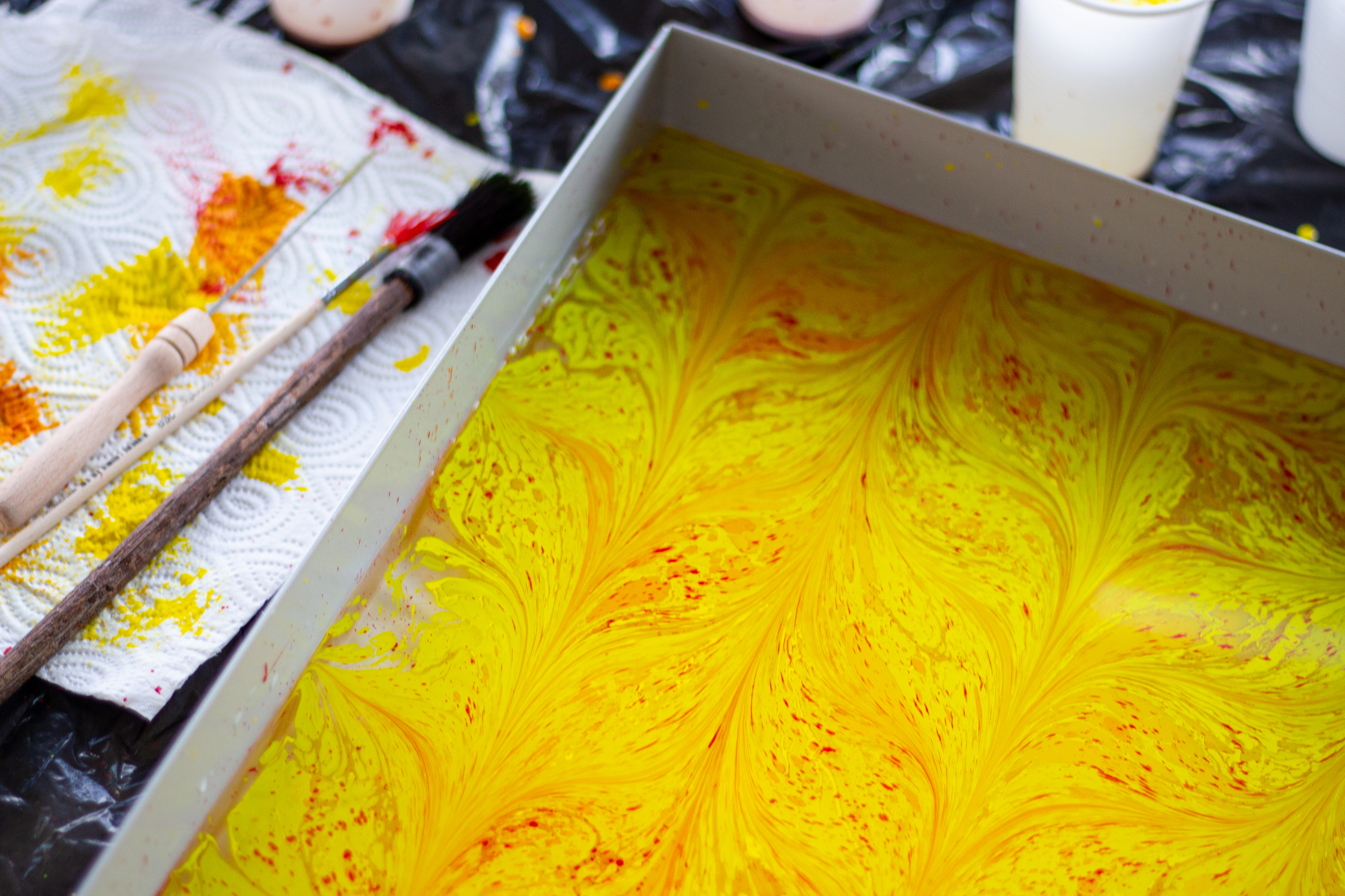
Using the traditional ebru (marbling) technique, I created series of illustrations for premium tea packaging.
The colours and illustrations refer to the fauna and flora of the region they come from, i.e. Ceylon from Sri Lanka, Longjing – China, Darjeeling – India.
I have obtained interesting effects using ebru brushes and needles. I scanned marbled papers and finished the illustrations in Adobe Photoshop.
Client:
Self-assigned project
tools:
Ebru, Adobe Photoshop

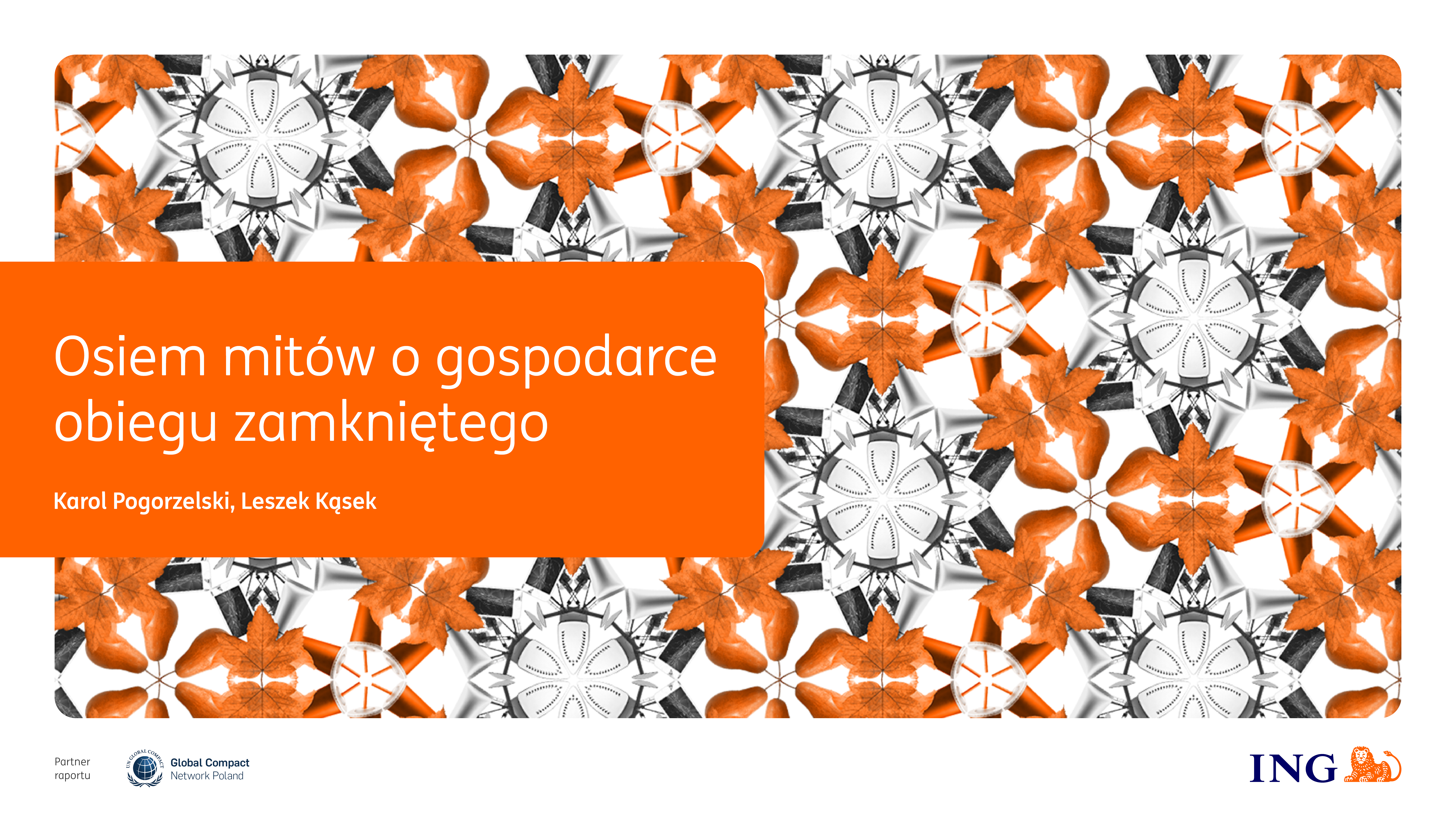
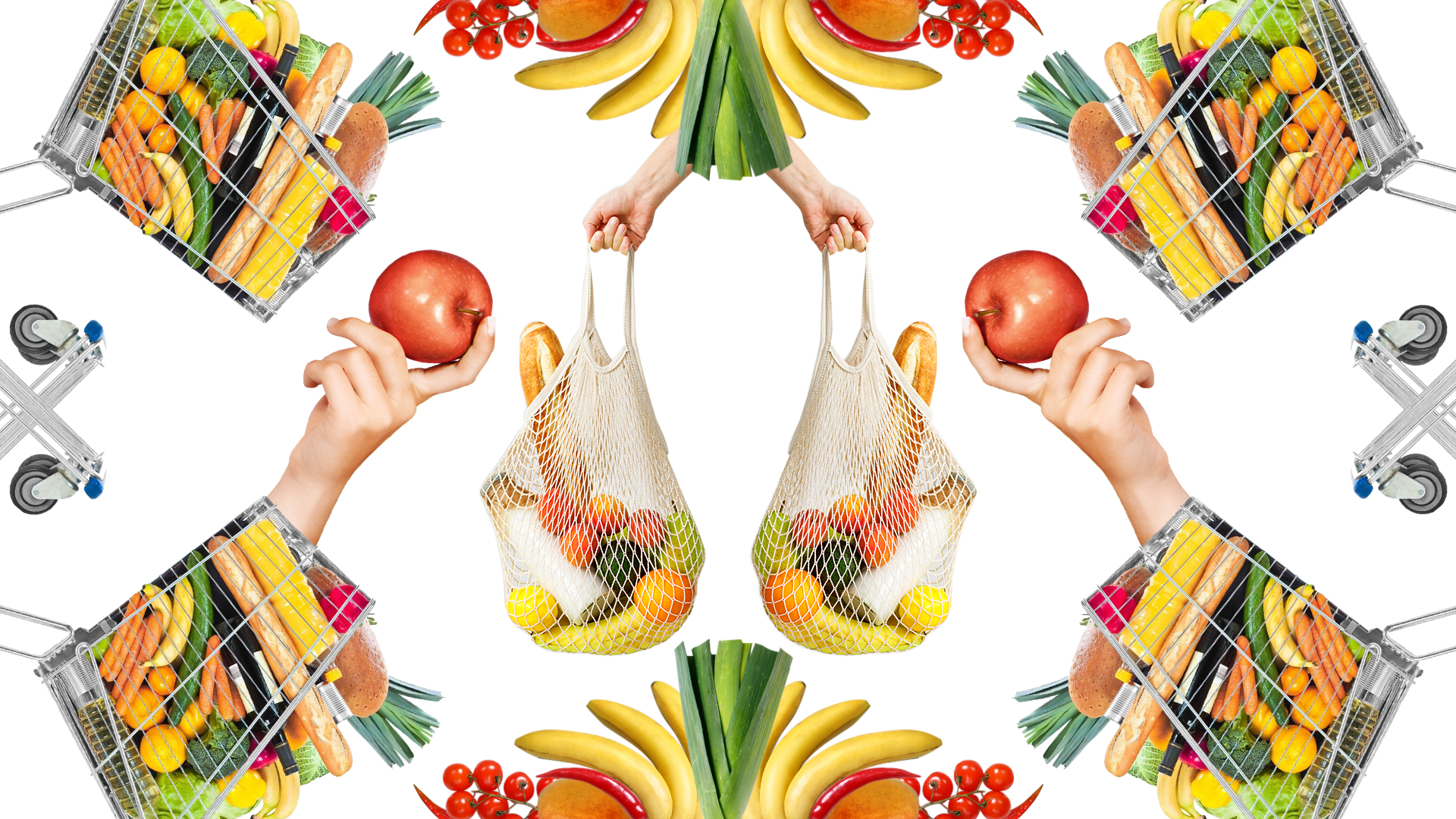
ING report Osiem mitów o gospodarce obiegu zamkniętego
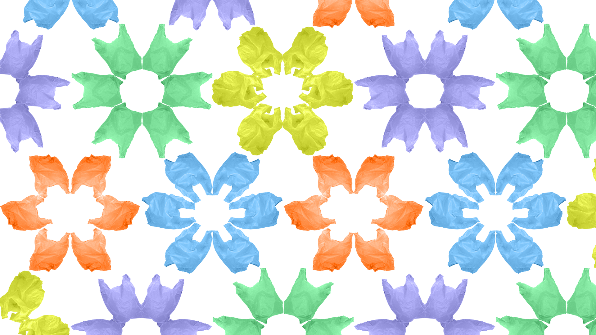
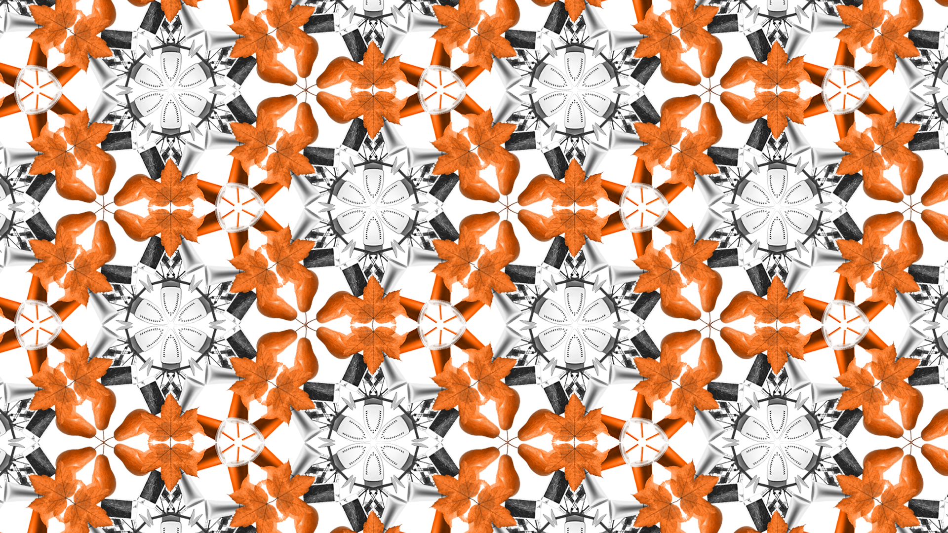
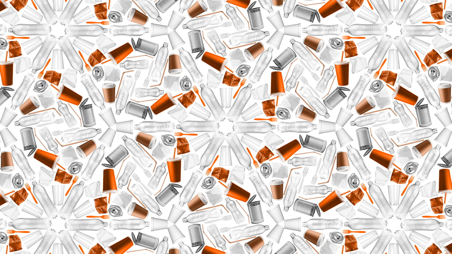
I designed a report for ING about the circular economy based on the brand manual. Illustrations were inspired by kaleidoscopes and symmetry.
The repeatability of the elements illustrates the idea of zero-waste movement and re-use of the same items, as well as the multitude of products produced as a result of a consumer lifestyle.
The layout of each illustration corresponds to the content of a given chapter, for example, the second part of the report deals with the topic of fossil fuels, which is why I showed the dark and dirty side of mining, and in the last chapter, talking about the global economy, I put together leaves from different parts of the world in the shape of the globe.
For the purposes of the report, I have also created charts, infographics and icons.
The project was made in the Logotomia graphic studio.
See full report here: https://www.ing.pl/_fileserver/item/dagex8r
Client:
ING Bank Śląski
tools:
Adobe Photoshop


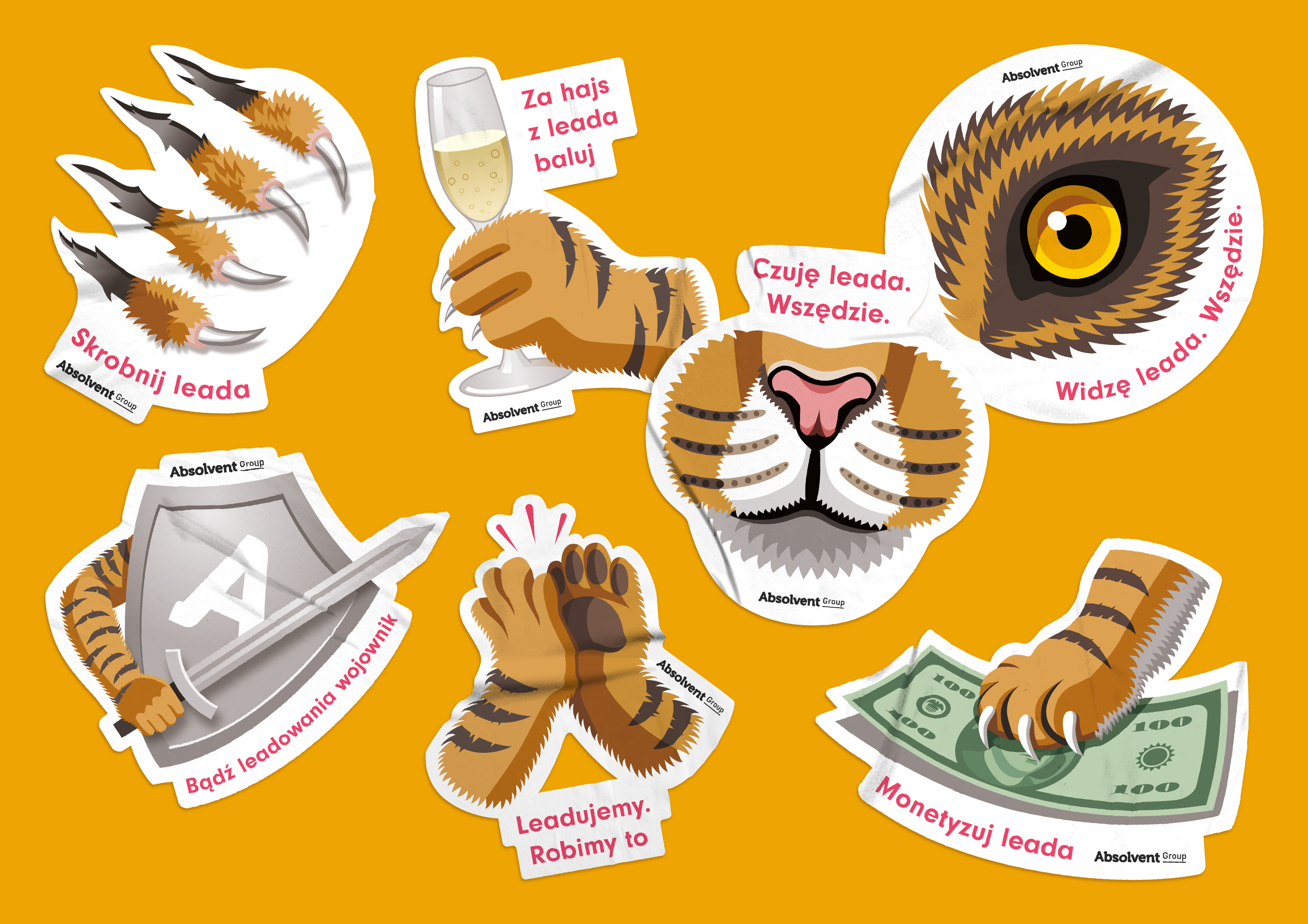
Stickers design for Absolvent Group
While working at Absolvent Group I have designed stickers promoting contest for Sales Department.
I have started from sketching on paper, then I have used Adobe Illustrator.
Client:
Absolvent Group
tools:
Adobe Illustrator


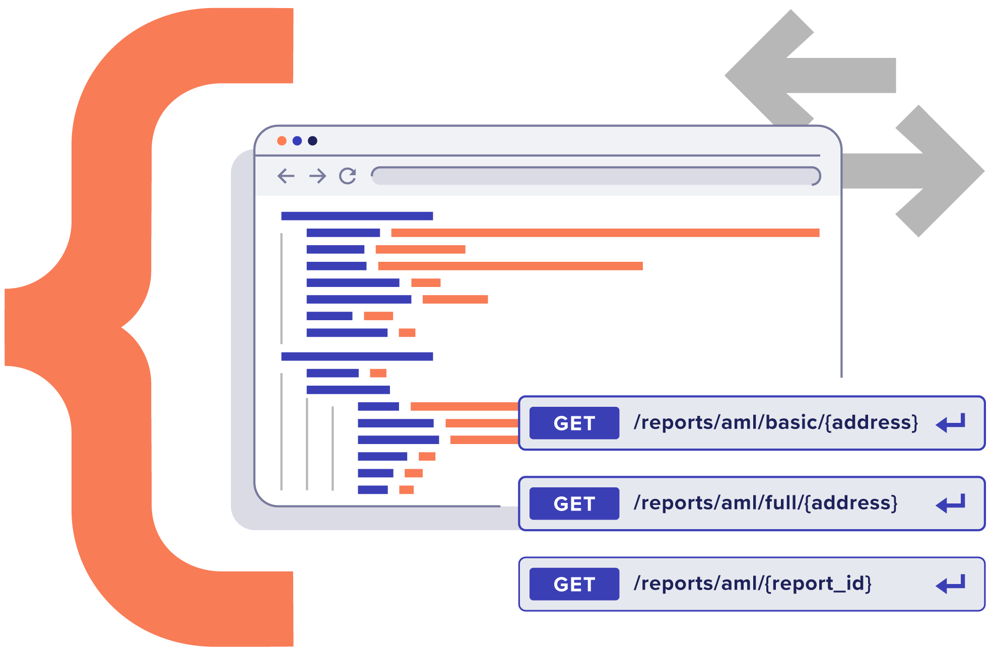
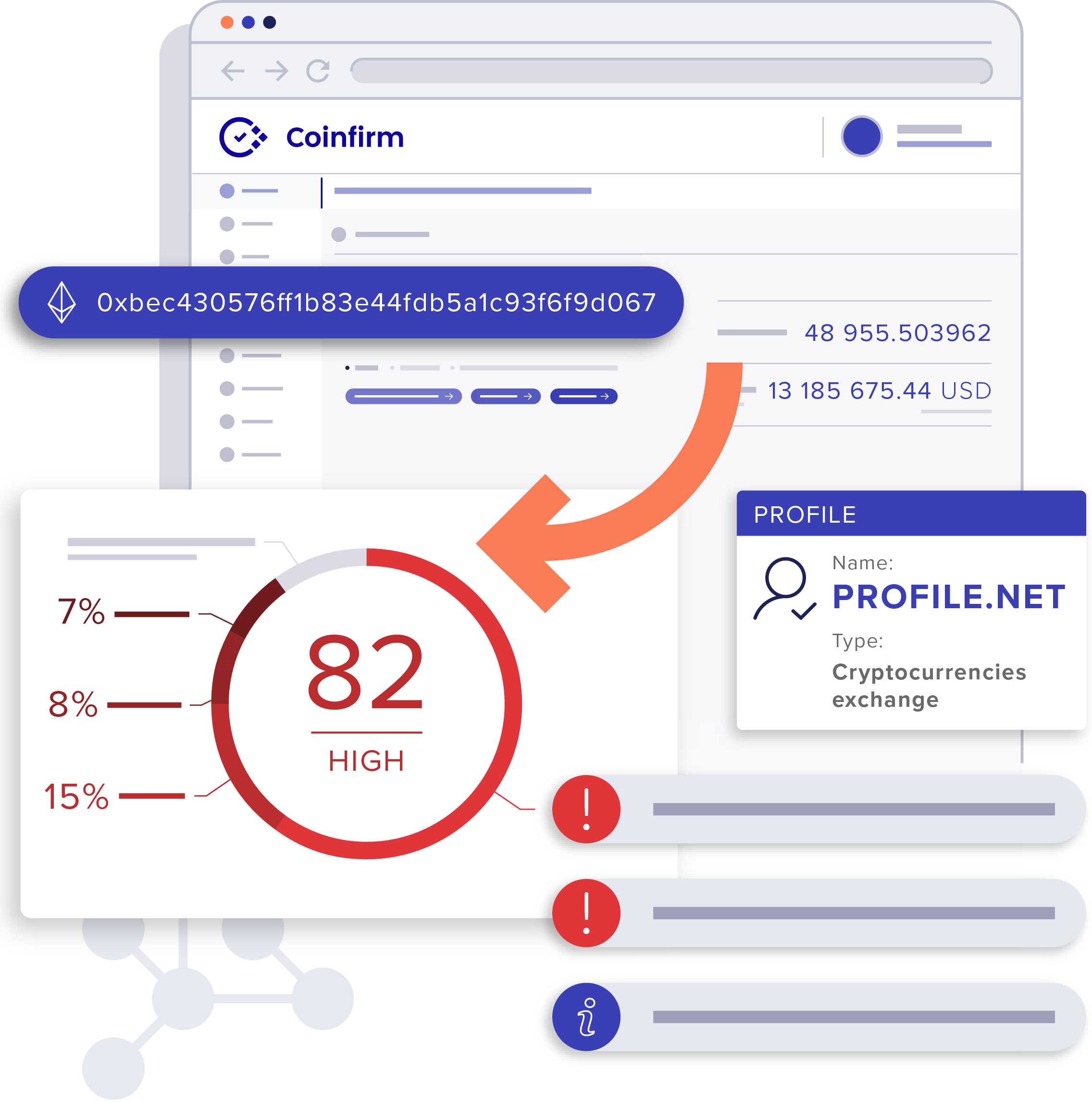
Illustrations for Coinfirm website
I have created illustrations in Adobe Illustrator for Coinfirm website.
Coinfirm is the industry leader in blockchain analytics and investigations. Illustrations explained the products and services that company provides, for example AML and Reclaim Crypto Services.
Client:
Coinfirm
tools:
Adobe Illustrator


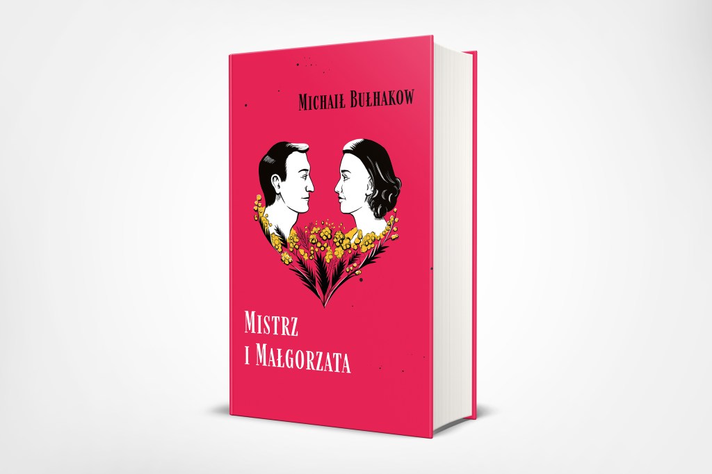
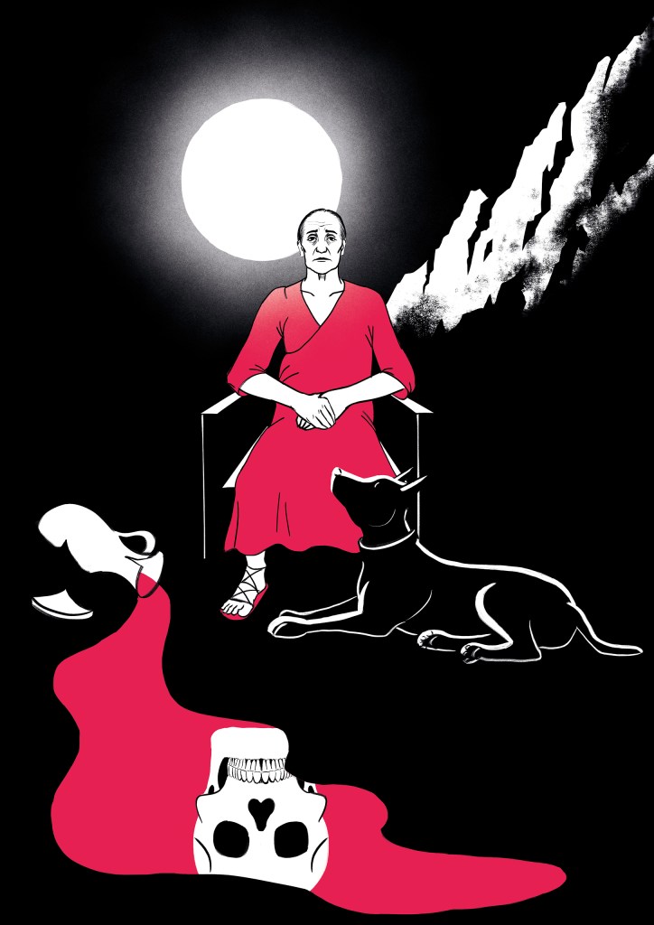
Illustrations for The Master and Margarita
I have created illustrations for “The Master and Margarita”, a novel written by Russian writer Mikhail Bulgakov.
Every illustration is full of symbols and metaphors, for example skull and sandglass symbolize passing time and memento mori. Portrait of Margarita sitting by the mirror was inspired by George de la Tour’s painting “The Penitent Magdalene”.
Illustrations were created in Adobe Photoshop. I have used markers and contrasting colors, because they suit dark, expressive climate of the novel. Bright red was chosen because it represents blood, love and passion, while green is complimentary color.
Client:
Self-assigned project
tools:
Adobe Photoshop


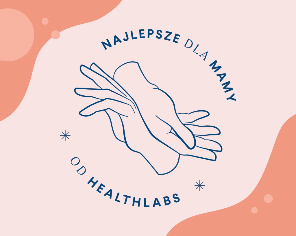
Logotype for Mother’s Day campaign
For Health Labs Care, I have designed several logo proposals for the Mother’s Day marketing campaign.
I included in the project the slogan of the campaign “Najlepsze dla Mamy” (The best for Mother).
Hands symbolize tenderness, small gestures, closeness between mother and daughter.
I drew sketches, then scanned them and finished the project in Adobe Illustrator.
Client:
Health Labs Care
tools:
Adobe Illustrator