Redesign of wine labels
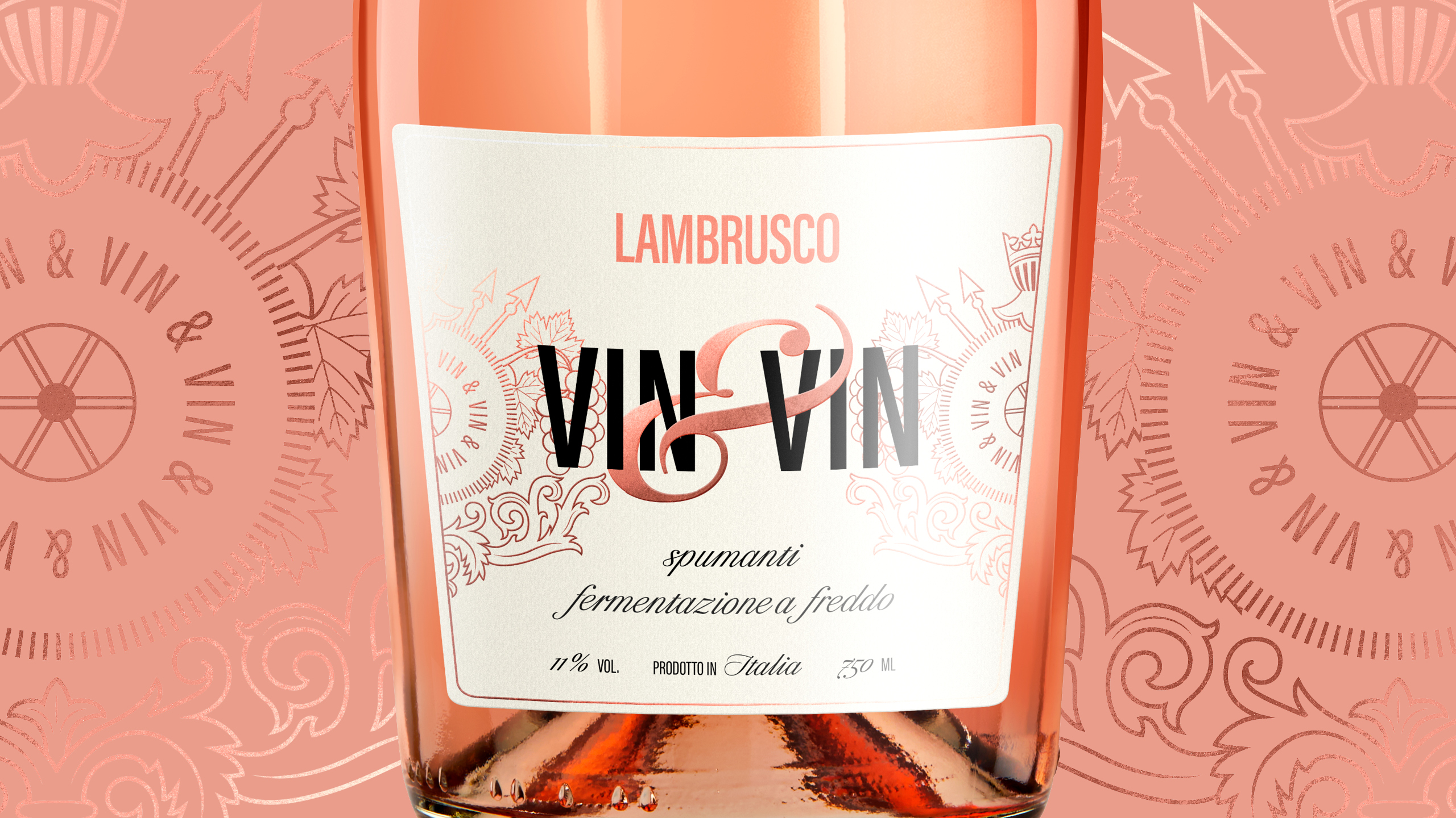
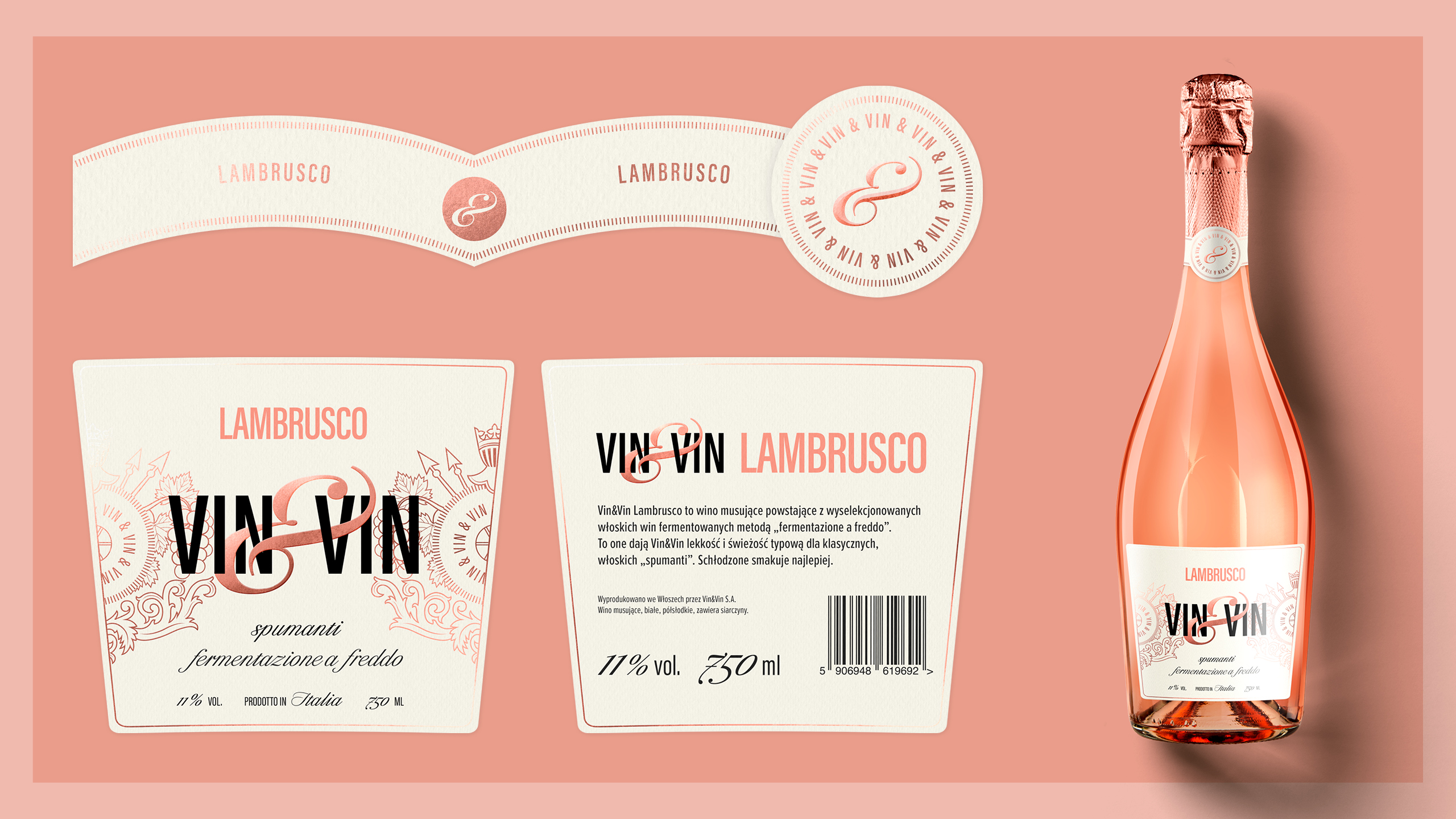
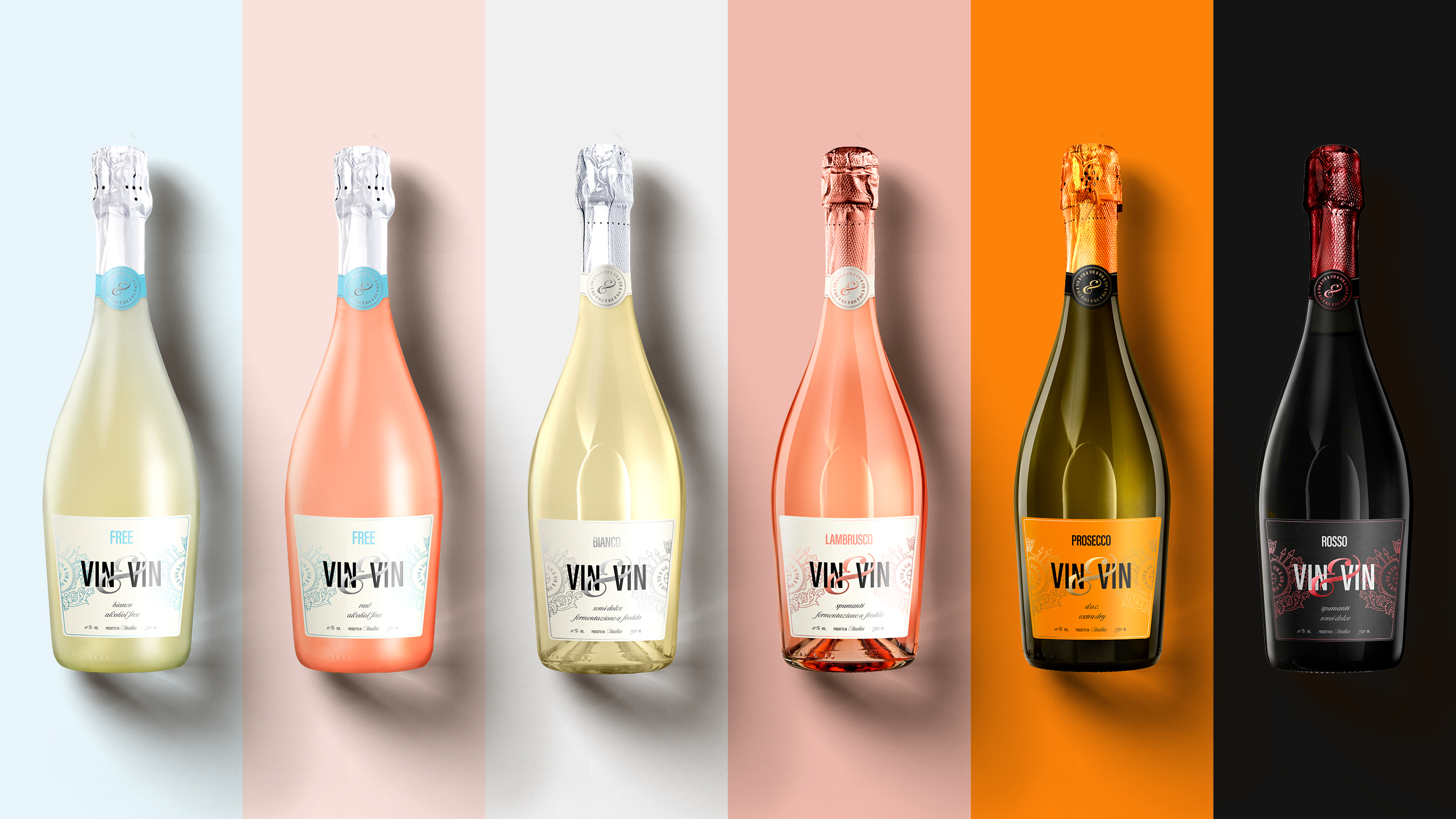
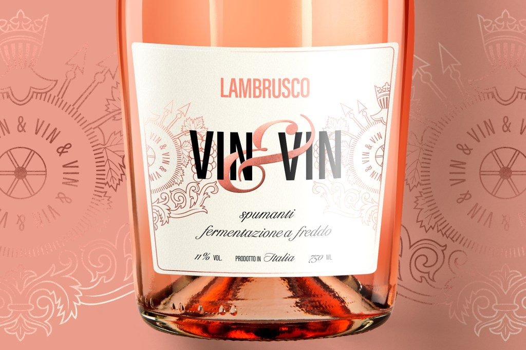
The project of refreshing wine labels included designing a new logo and coat of arms, selection of typography, unification of the layout and color palette.
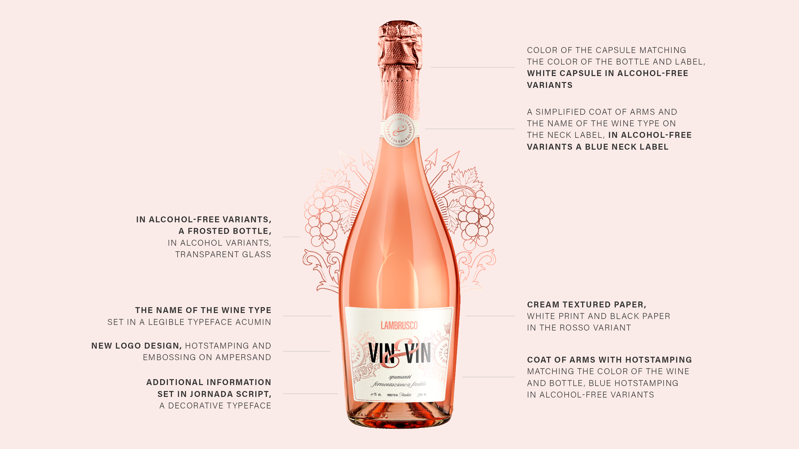
Typography is based on contrast – the modern Acumin grotesque has been juxtaposed with the Jornada Script typeface derived from calligraphy.
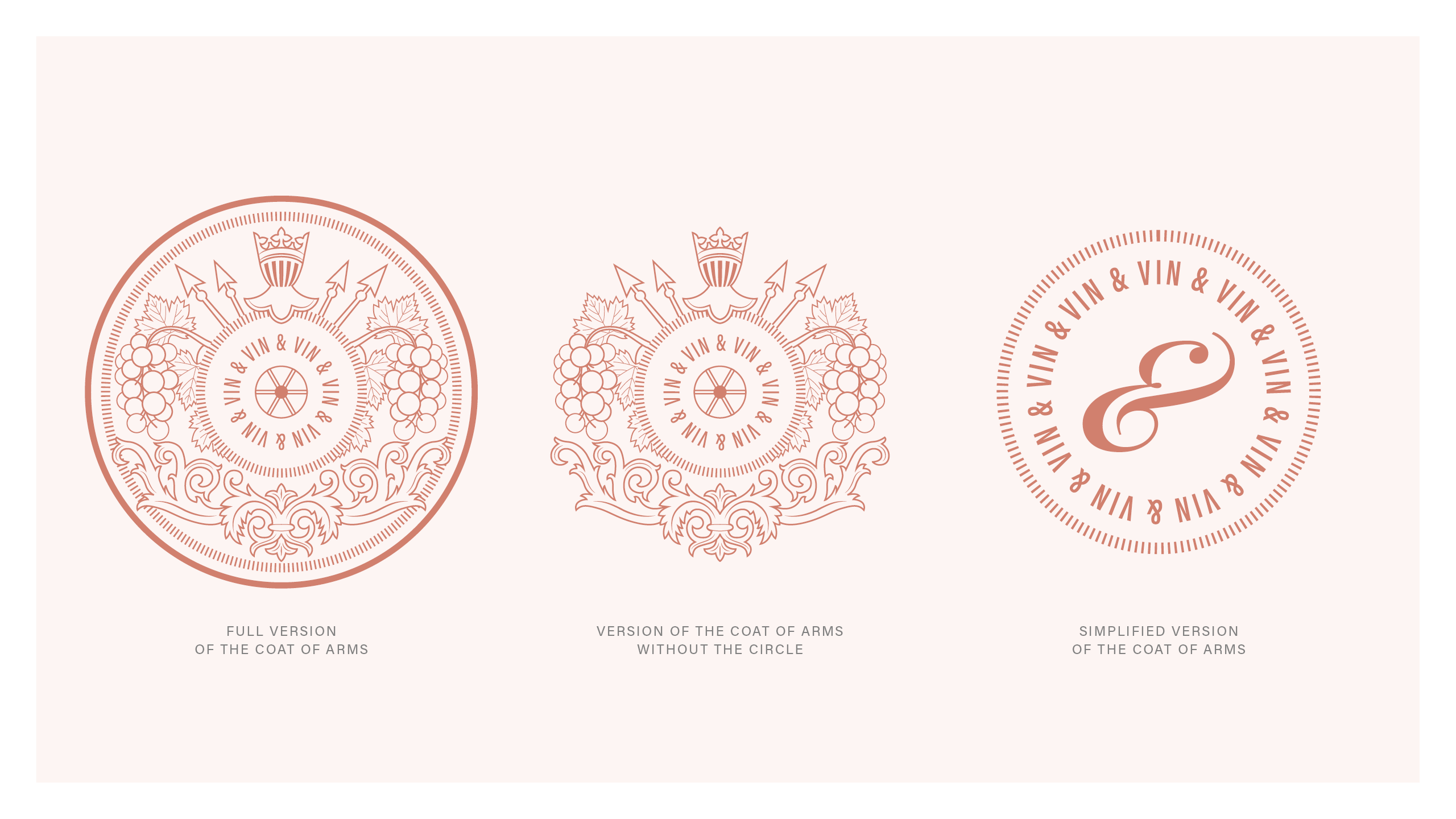
In the new logotype design, I used the decorative ampersand (&) shape, which entwines the letters like vines.
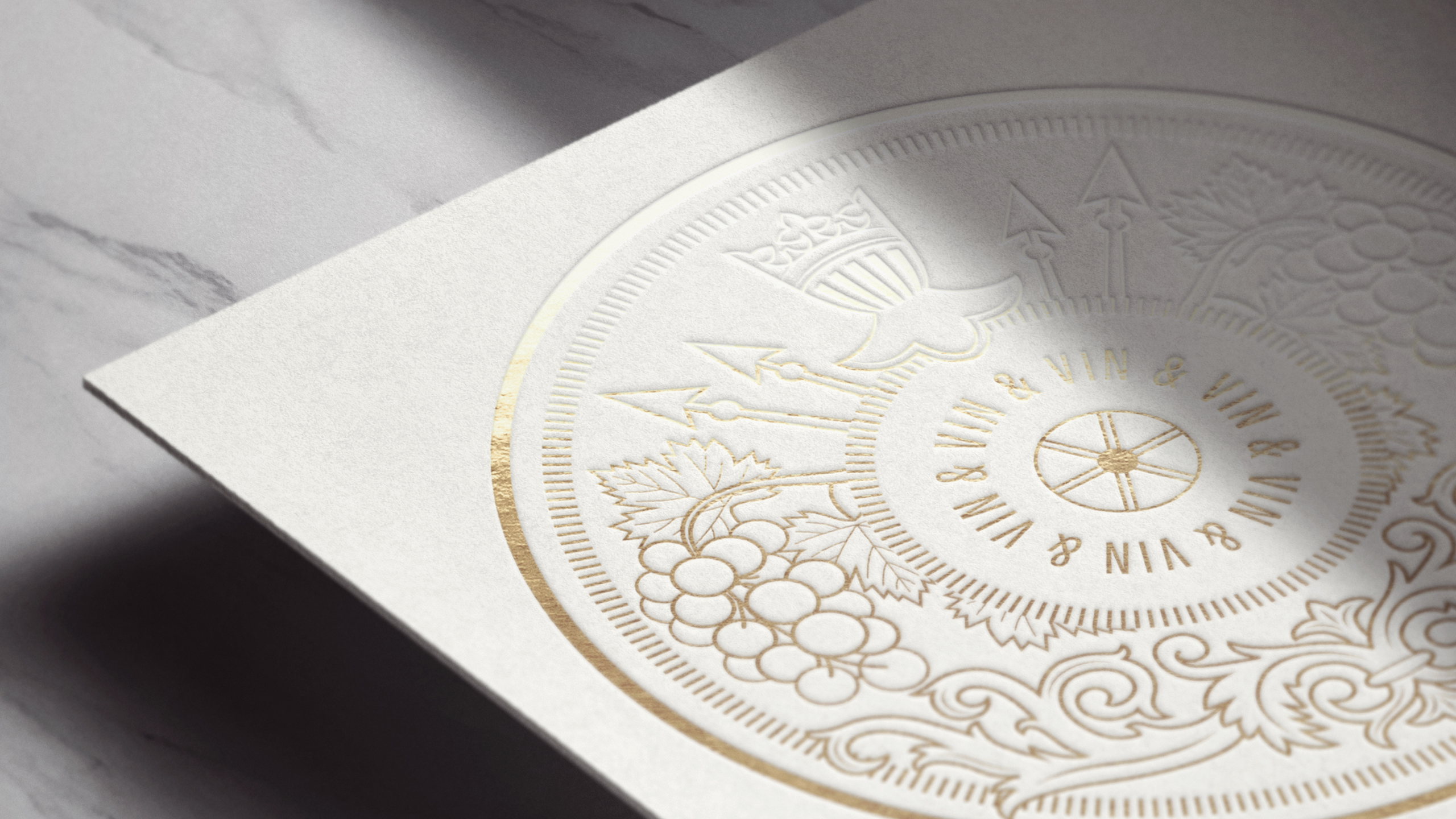
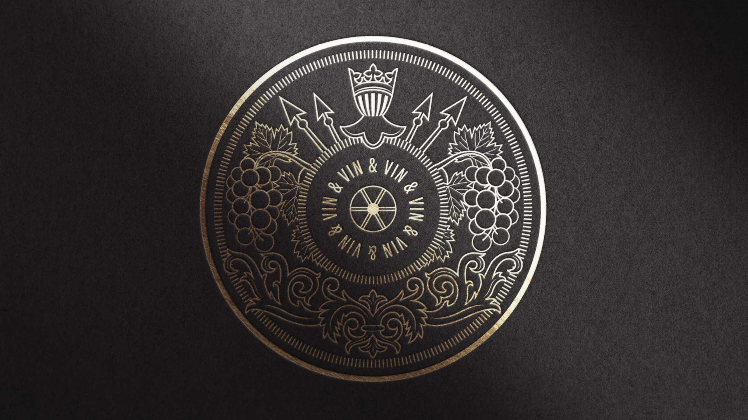
The coat of arms was simplified, the thickness of the lines was unified and adapted to various reproduction techniques, including embossing and hot stamping. I added vines referring to the winemaking process and a helmet with a crown.
Client:
Wine producer
tools:
Adobe Illustrator