Redesign of National Museum in Warsaw website
The current website of the National Museum in Warsaw, one of the largest museums in Poland, was designed many years ago. For this reason, I decided to refresh it – make it more visually attractive and more user-friendly.
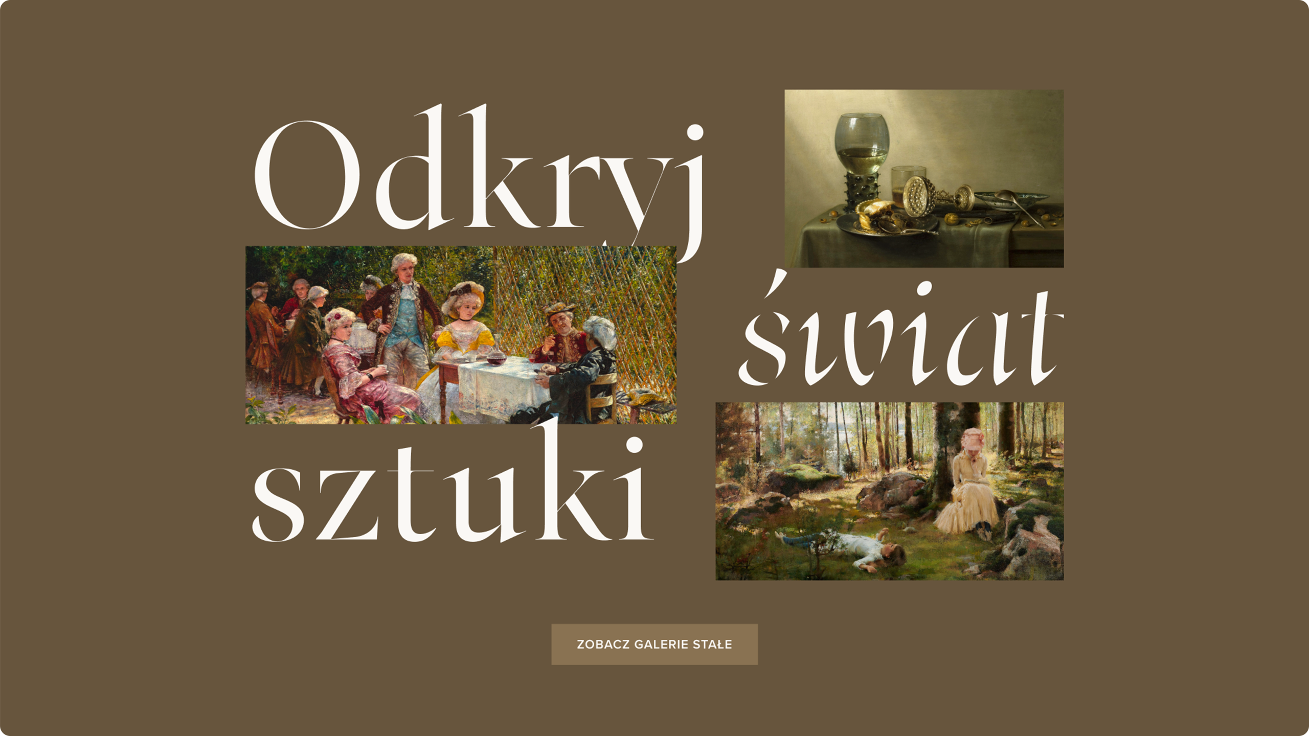
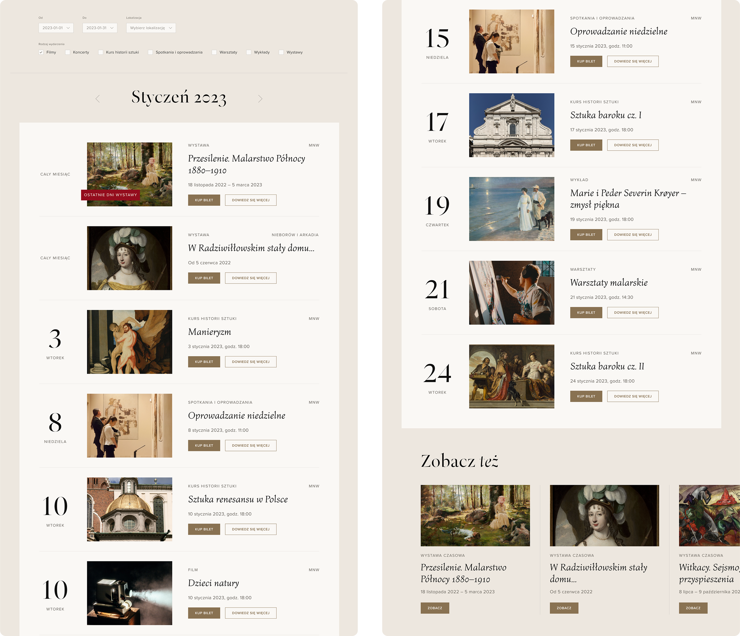
I analyzed the current website of the museum and the websites of other museums and cultural institutions. On this basis, I included best practices in this project, such as placing opening hours and information on whether the museum is currently open on the homepage, showing the best exhibits from the permanent collection on the homepage, showing a list of current events and exhibitions, simplifying navigation and placing buttons ” Buy tickets” in prominent places.
It is difficult to find information on the purchase of tickets on the current website of the Museum, which is why I have placed the “Buy tickets” button in the menu as well as on the subpages of events, exhibitions and permanent galleries.
The current museum website is very extensive and has many subpages, so I decided to simplify navigation and place the most important links from the user’s point of view in the menu: visit, permanent galleries, events, buy a ticket, language selection and search engine.
I made the ticket purchase process simpler by using breadcrumbs that allow the user to go back to the previous stage and see what stage the user is currently at.
To make the site attractive to tourists, I have placed large reproductions of exhibits, a subpage about the history of the museum, and on each subpage there is a section with a link to the subpage “Visiting the museum”, where one can find opening hours, ticket prices, interactive map and directions.
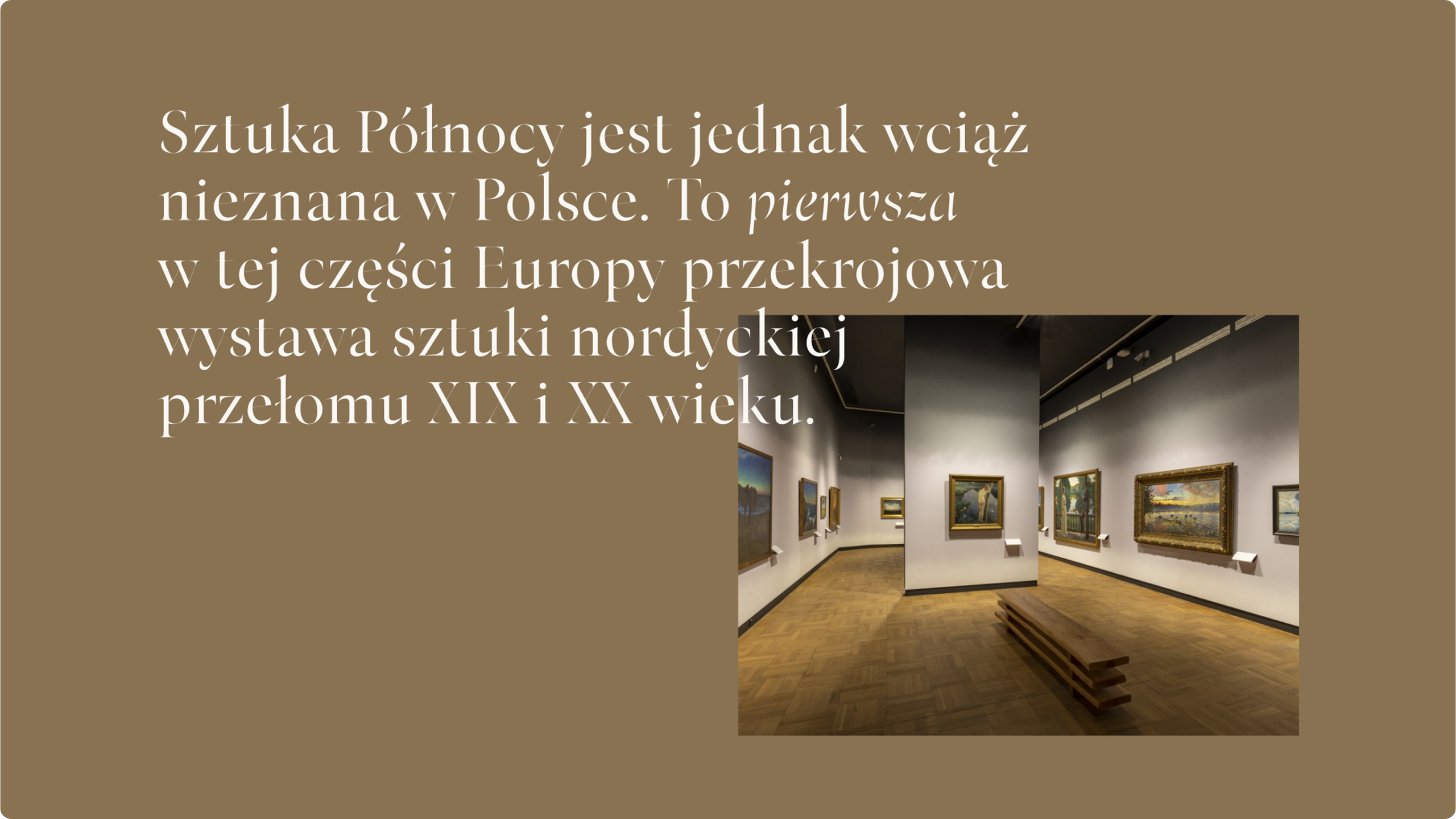
Thinking about the regular visitors of the museum, I have placed a news section on the homepage, where the latest temporary exhibitions and events are shown.
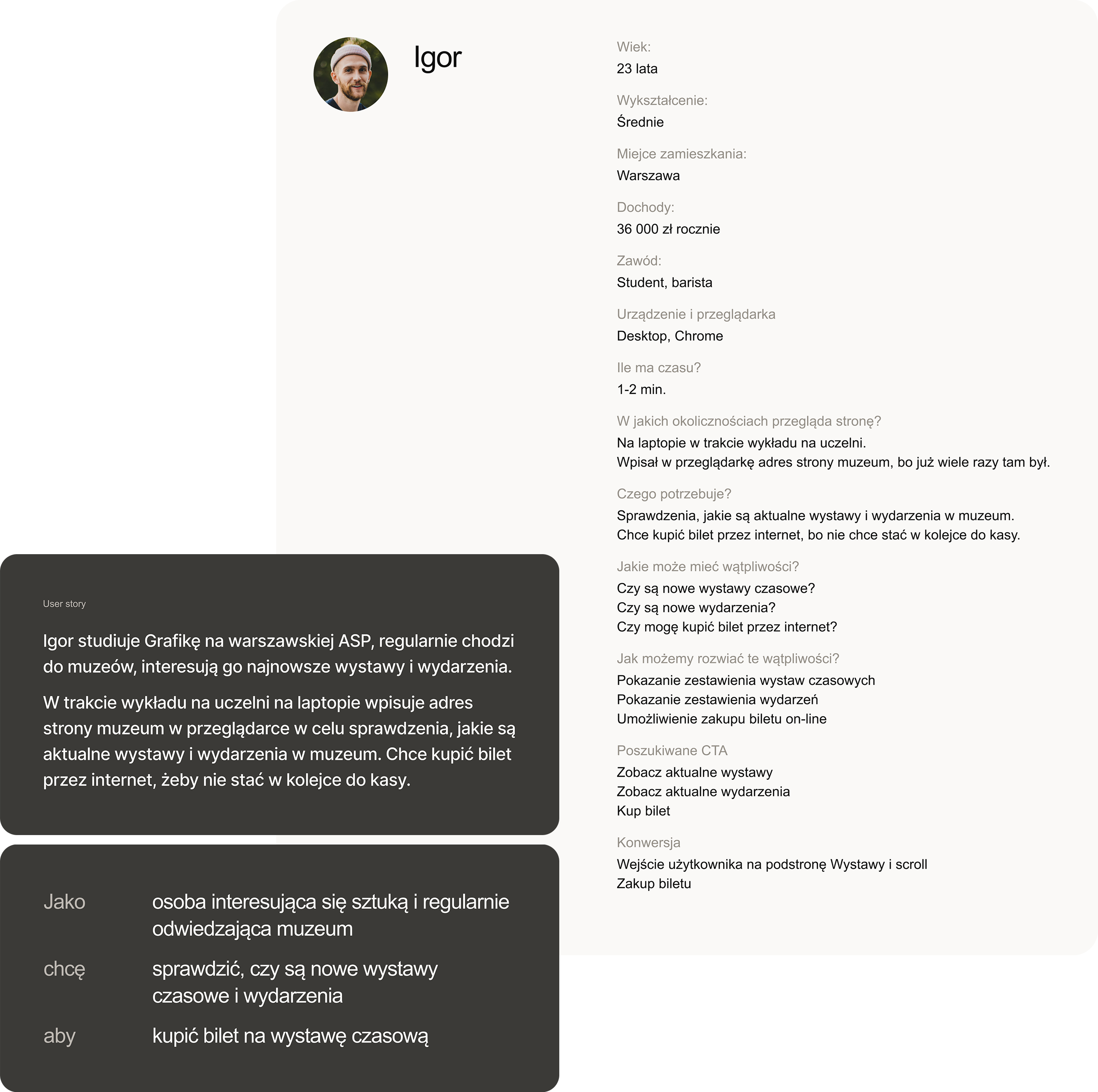
The project includes UX analysis — analysis of the current website and competitor websites, information architecture, site map, user personas and user flows. I developed a design system that includes text styles, color styles, grid styles and components. I designed the website in both desktop and mobile versions, I created interactive prototypes with animations and micro-interactions.
Client:
Self-assigned project
tools:
Figma