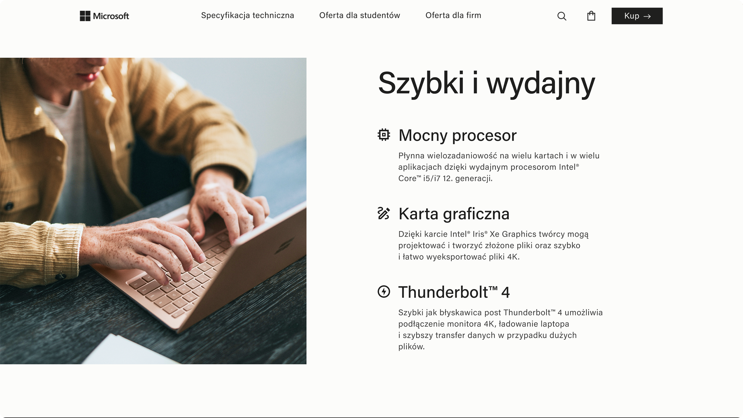
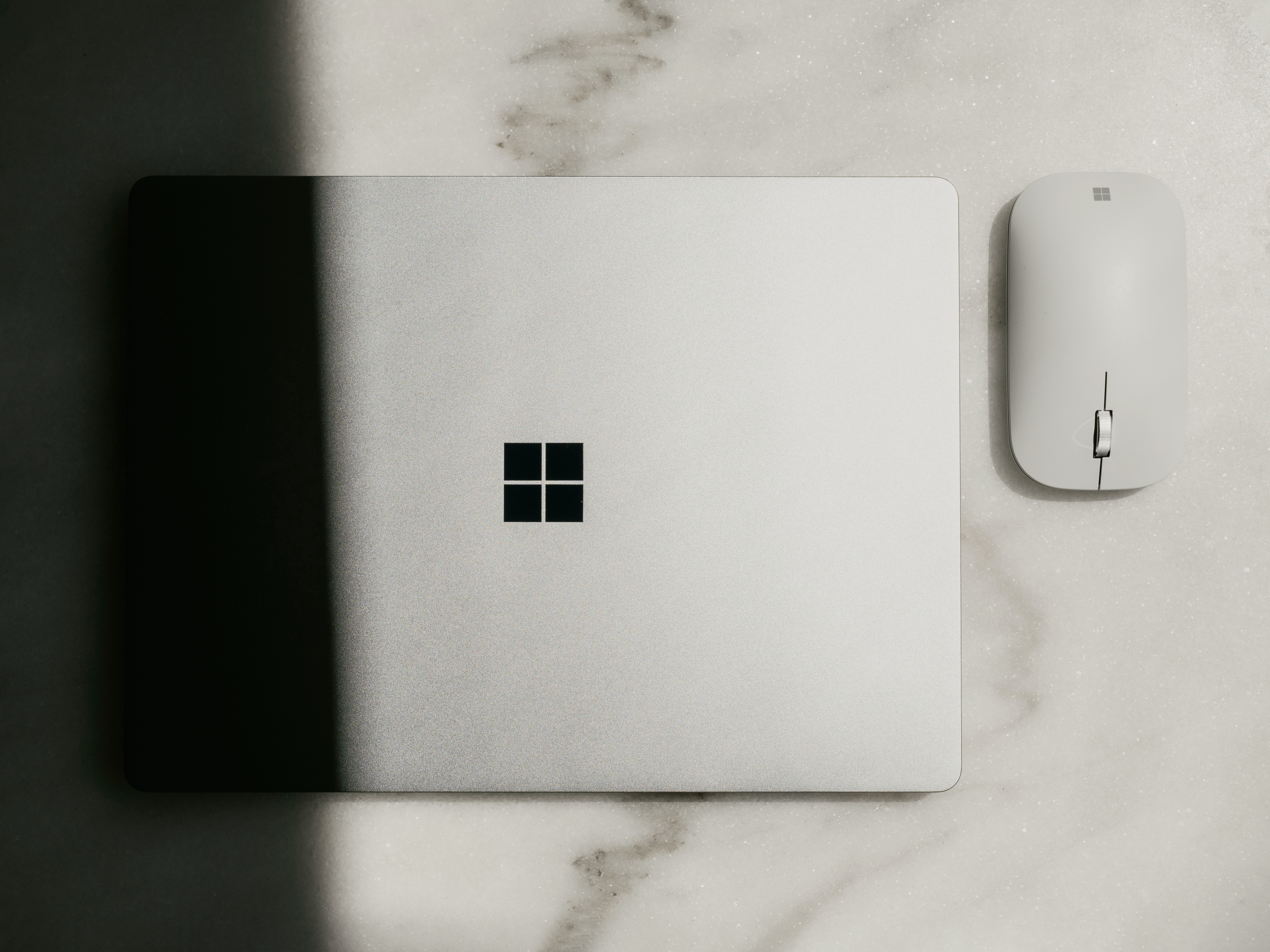
Redesign of Microsoft Surface landing page
To make the site visually attractive, I used large photos of people using a laptop, icons and a lot of negative space. The minimalist, modern aesthetic is based on black, white and shades of gray and sans serif typography.
The project includes UX analysis – analysis of the current website and competitor websites, user personas, user flows, user stories and sales funnel. I developed a design system that includes text styles, color styles, grid styles and components.
I designed the website in both desktop and mobile versions, I created interactive prototypes with animations and micro-interactions. What’s more, I designed a table with technical specifications and a purchasing process with interactive forms, dropdowns and breadcrumbs.
Client:
Self-assigned project
tools:
Figma